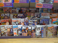
This was a task where I went into a shop that soled music magazines. Here, I took images of the layout of these magazines and this is where I analyse them.
In this image, you can see that they are a lot of different music magazines. The most prominent magazines are Classic Rock, UNCUT, CLASH and NME, this is to do with either the brand name stands out, they are put first on the shelf or the design is clear to the audience. Classic Rock is put into it's on front section as it is a well known magazine and the main feature may be important to the audience.
These magazines in this image seem to be the less popular brands (hence ring on the bottom shelf), this gives the impression that not as many people will buy these. The magazines are shown with not many copies and by looking at the Jazz magazine, it appears that the bottom row might appeal to an older audience.
This Kerrang! magazine is placed behind other magazines and does not look easy to locate. However, the intension of this might be that by making it less obvious the see, the people will look harder and by the time they have eventually found it, they will have found other magazines they want to buy. Also, the logo at the top of the magazine is very noticeable, making the people adamant to find it.
In this image, the Q magazine is highlighted as the logo is positioned in the top left hand corner, making the people's eyes drawn to the cover. Although, it is tucked behind the other magazines, the logo and its colours makes it contrast to all the other magazines.
From this task I have learnt what needs to be included on my magazine front cover so that it looks appealing on the shelf and attracts the target audience.


No comments:
Post a Comment